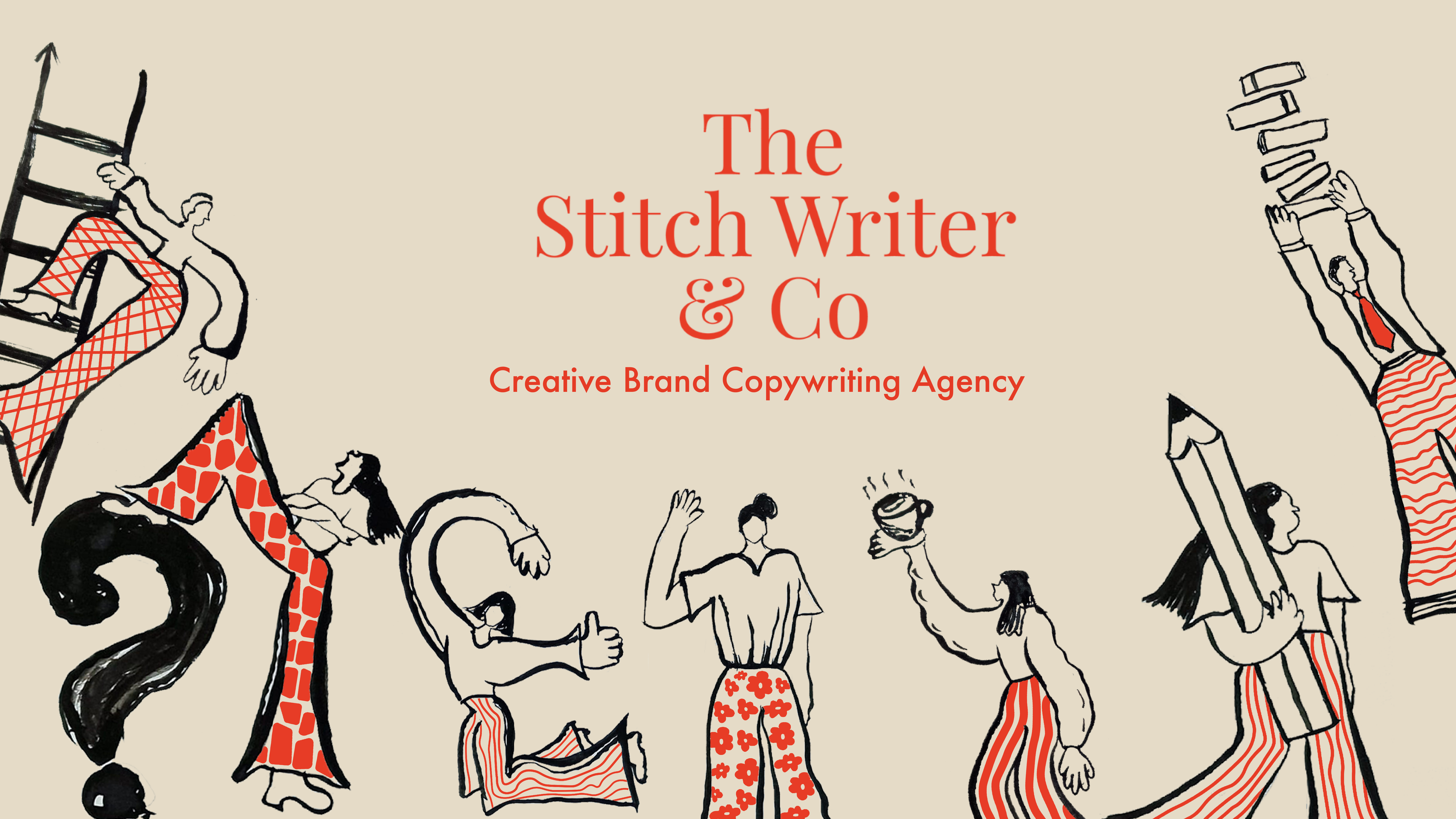
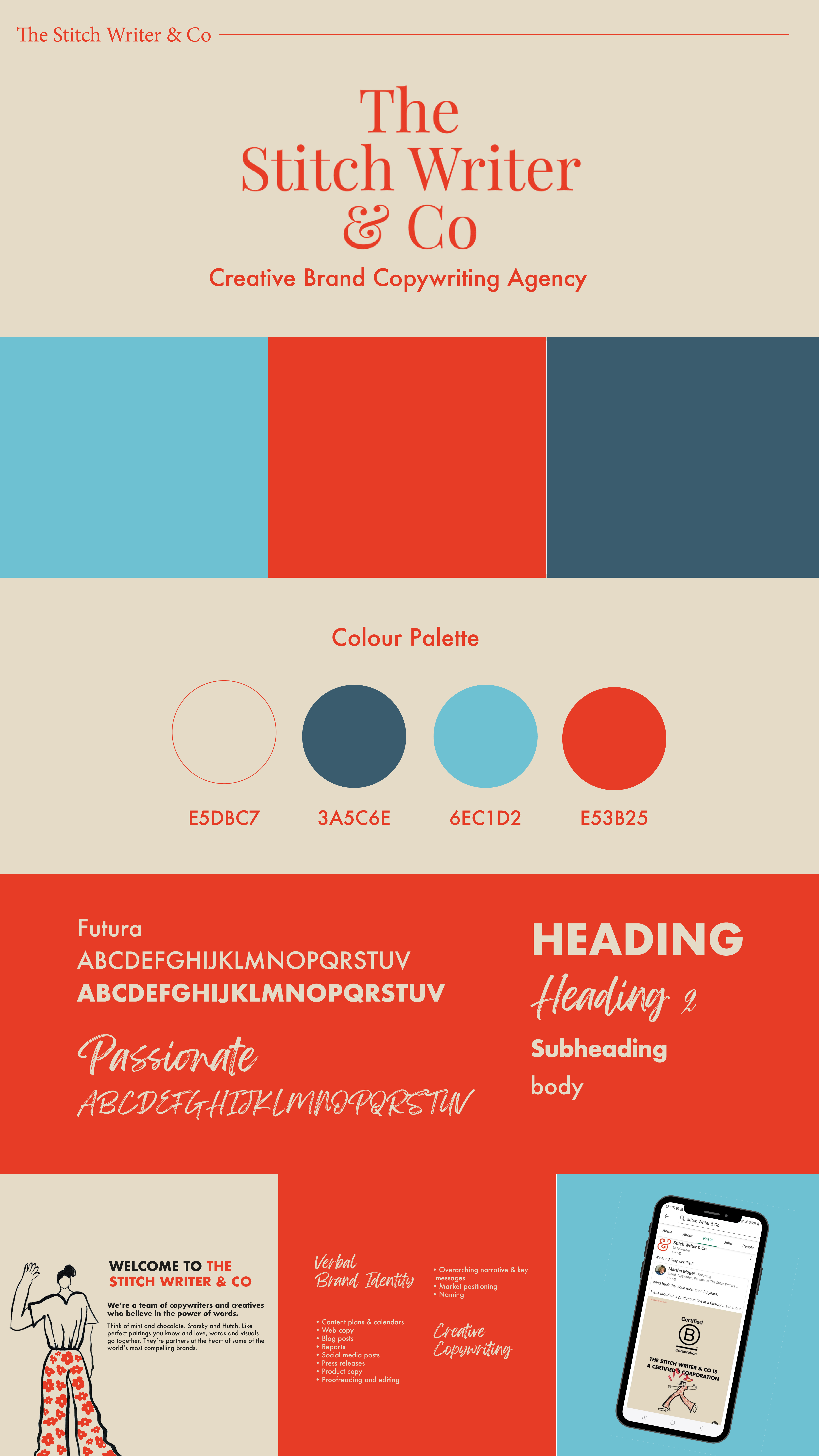
The Stitch Writer & co
During my internship, my initial brief was to create a visual branding for The Stitch Writer & Co, using my illustration and compositional skills to determine a cohesive graphic language.
Initial sketching
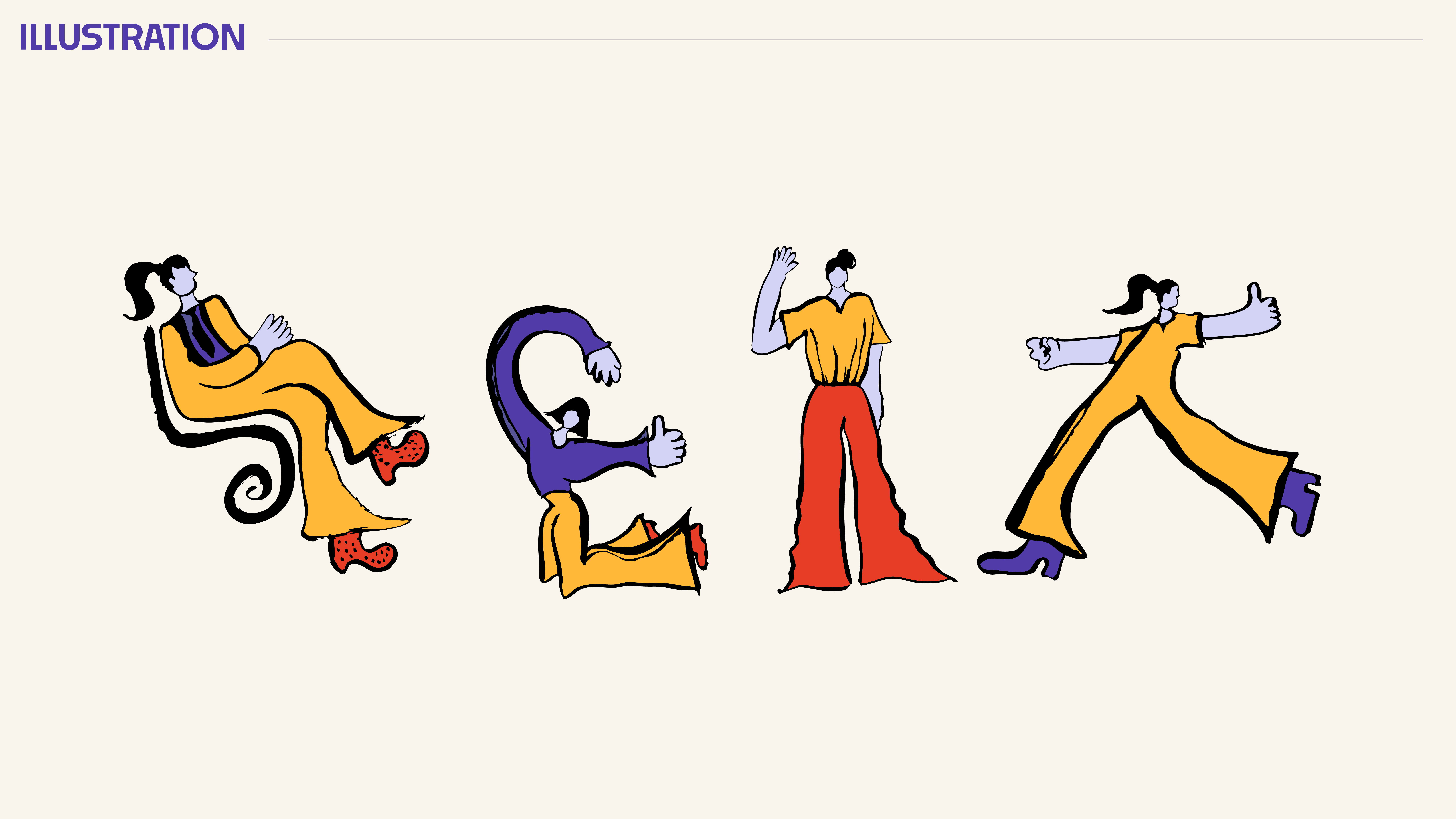
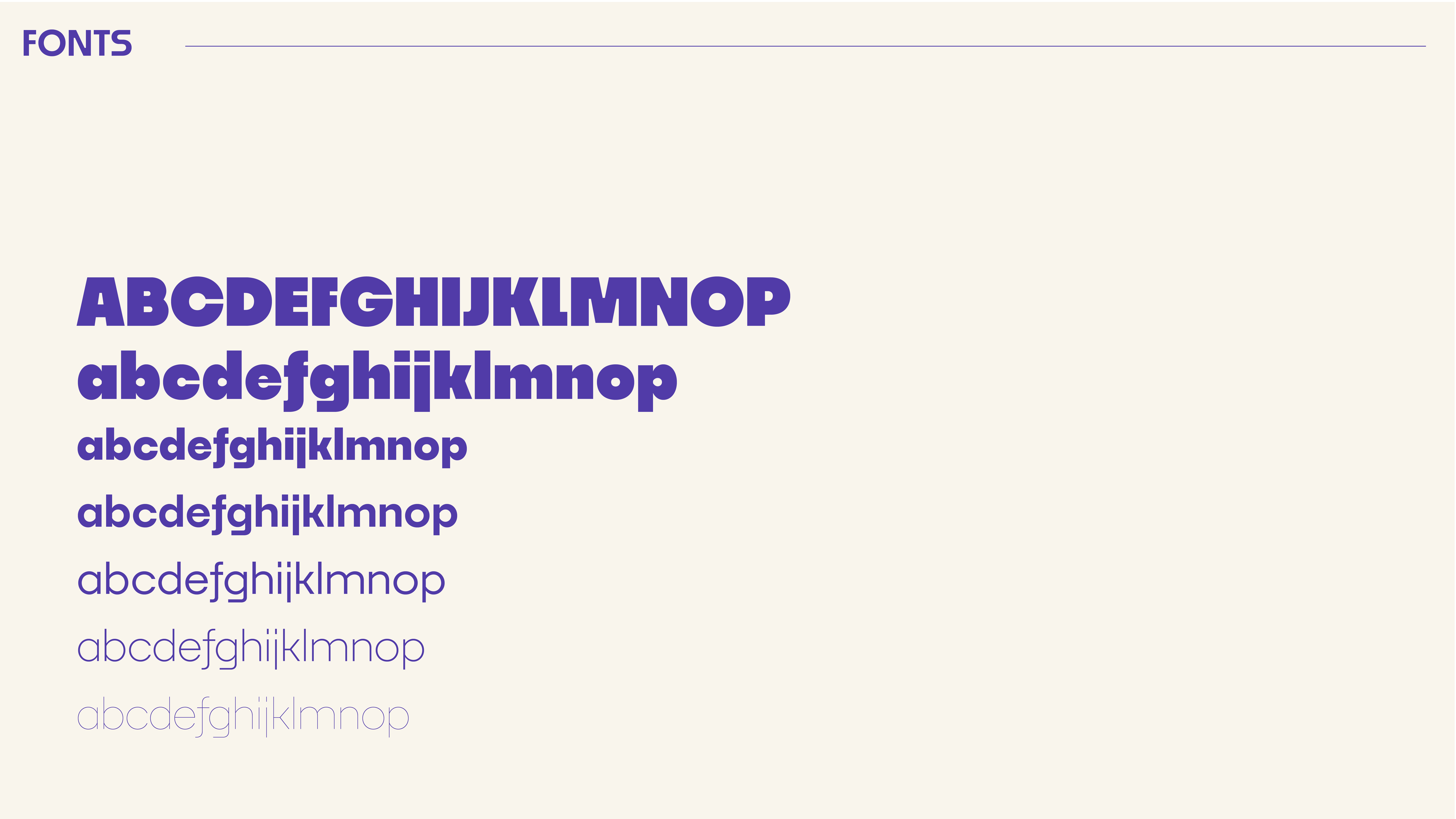
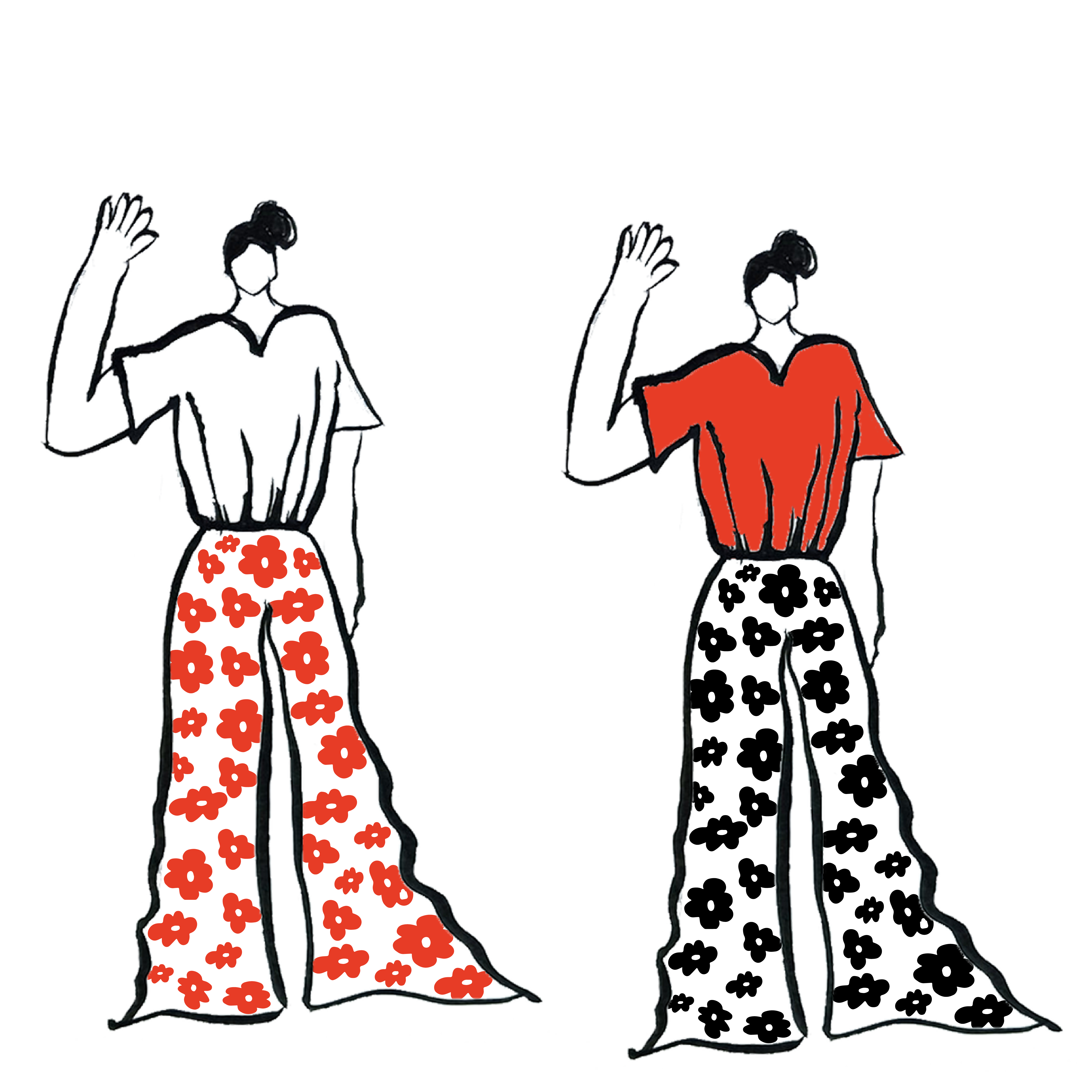
Following conversation with the agency's founder, I grasped a clear understanding of the desired tone for this brand: minimalistic, authentic and bold. I began illustrating characters and brainstormed typography and colour options.
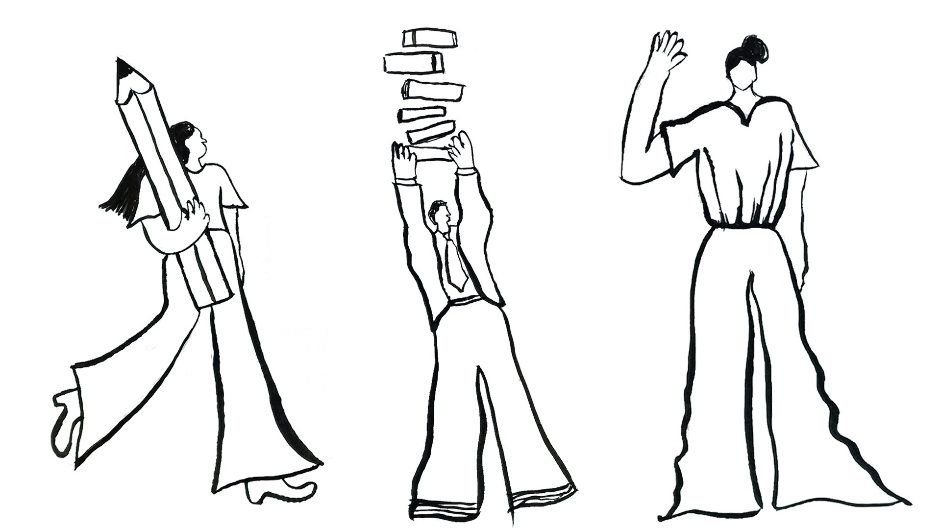
Developing illustrations
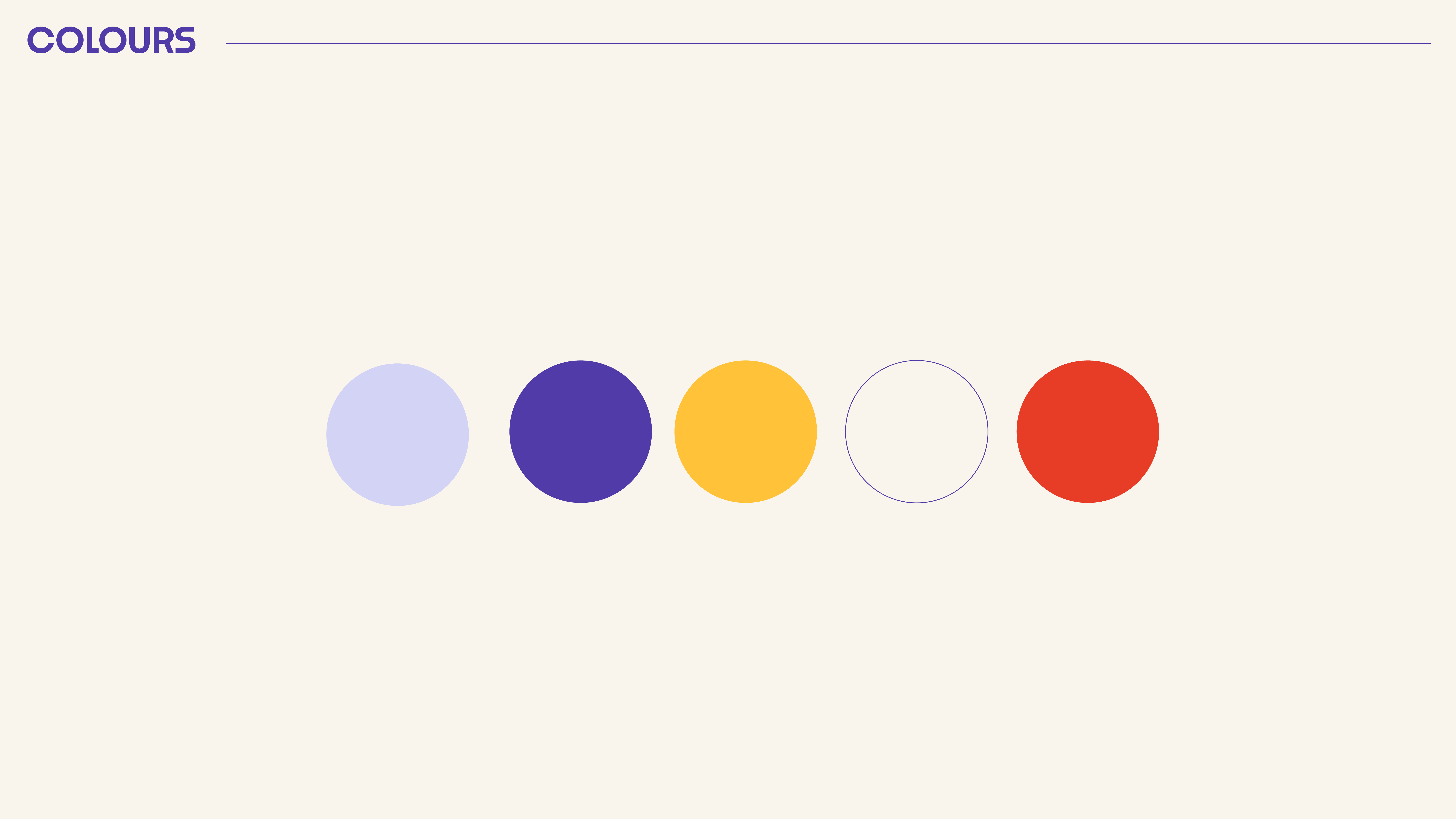
Keeping elements of the previous branding, I experimented with integrating the bright red into my ink illustrations to create a dynamic visual language. As previously discussed, the new branding aims to be minimalistic, therefore I minimised the range of colours used.
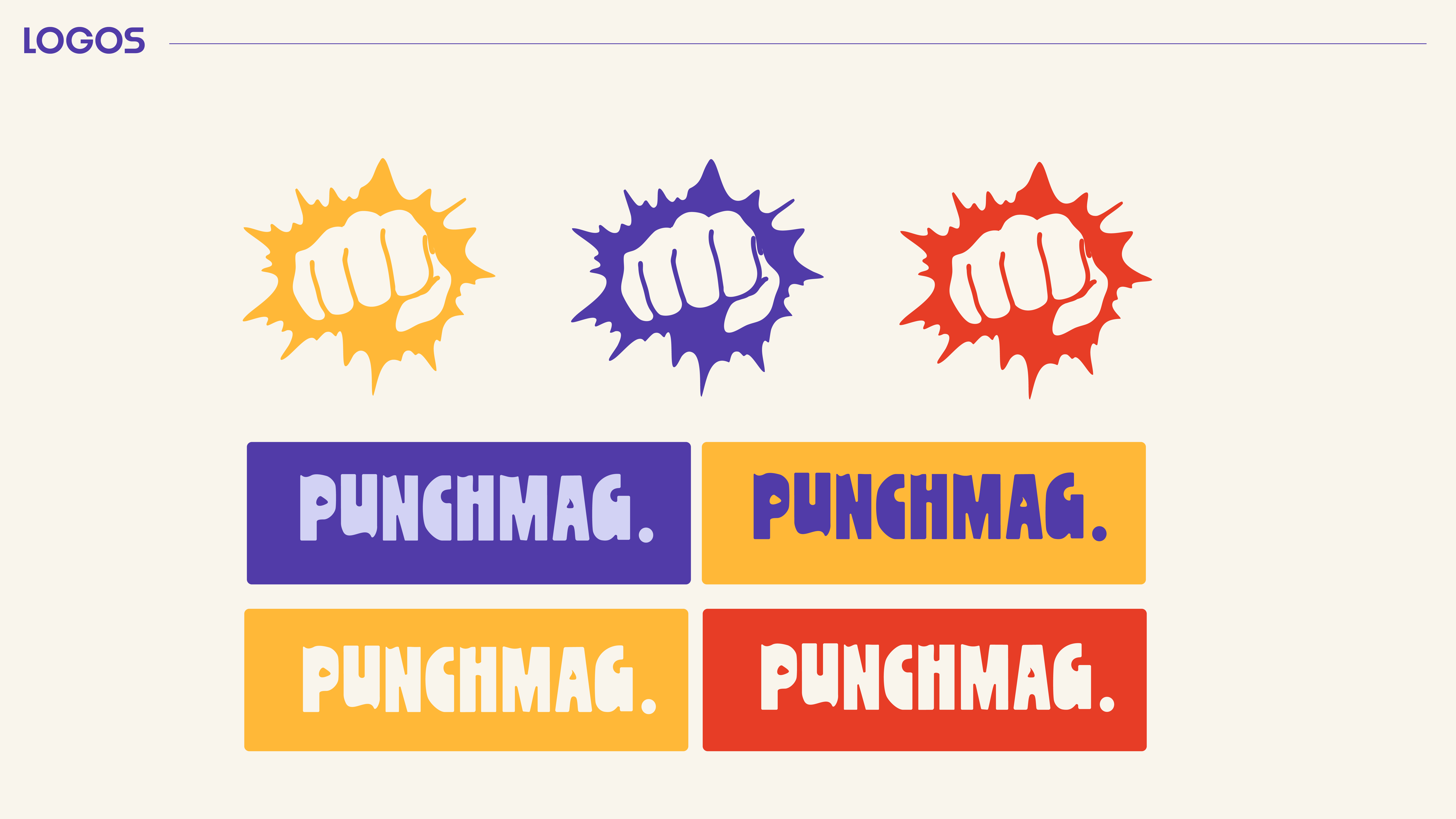
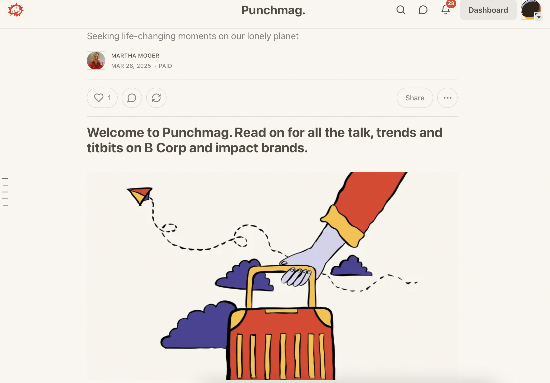
A new brief: PUNCHMAG.
Extending my internship into a part-time job, my next task was to create an exciting brand for the stitch Writer's new Newsletter. We intended to keep the main brand language, altering the colour schemes for a more vibrant tone.